Recognizing the need to enhance user experience, we initiated a comprehensive website redesign. This case study details the objectives, research, design process, and outcomes of the project. By prioritizing user-centered design, we aimed to create a platform that reflects our brand values. Through this redesign, we hope to increase product understanding and customer acquisition.
My Role
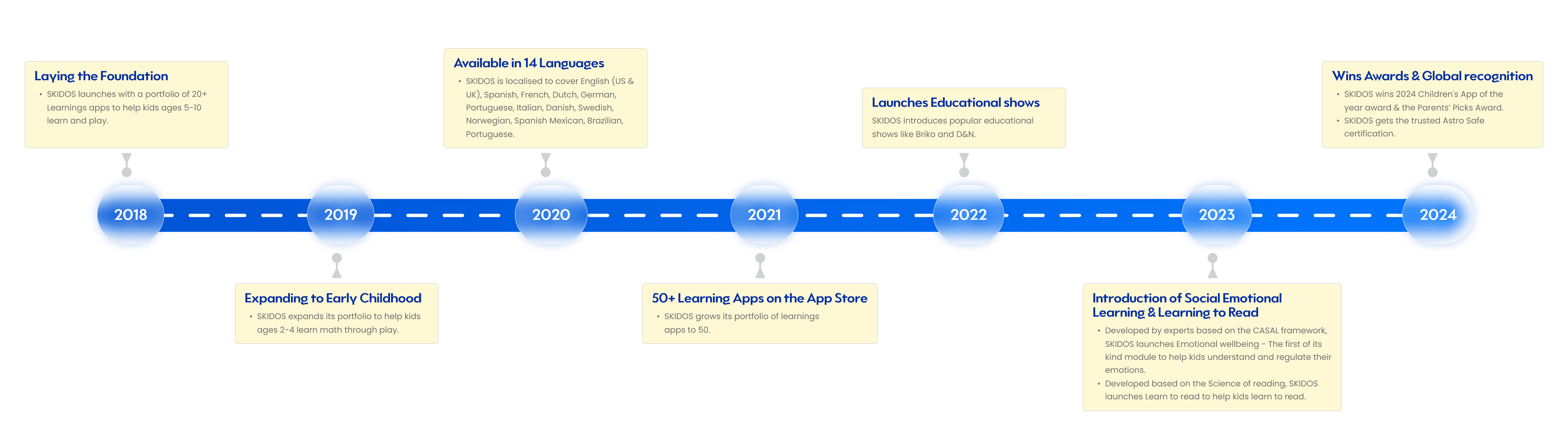
In this project, I led the comprehensive redesign of the Skidos website, focusing on both web and mobile platforms to ensure a fully responsive experience. My north star throughout this project was to ensure that this redesign not only revitalises the Skidos brand online but also established a scalable design framework for future enhancements.
Competitor Anlaysis
At the outset of the project, we conducted a comprehensive competitive analysis to assess how Skidos stands in relation to its competitors. Our analysis focused on both offline companies with physical products and those offering entirely digital product lineups, such as ABC Mouse, HOMER, Lingokids, SplashLearn. This dual approach allowed us to gain insights into various market strategies and identify areas for improvement and differentiation.
We found out that SKIDOS stands out as it:
Wider age group support (2-11 years)
Seamless integration of education and entertainment
Comprehensive subscription plan covering multiple games across subjects
Cross-platform availability (iOS, Android, etc.)
Ad-free experience
Detailed progress tracking and parental insights
Localized games for a global audience
We found out that SKIDOS stands out as it:
Subject-specific depth and structured learning
Price-sensitive markets with lower-cost or one-time payment apps
Teacher-guided content and expert-led lessons
Highly gamified, entertainment-focused learning without obvious educational overtones
Offline game availability
Robust free tiers with fewer restrictions
Localized content that adheres more to regional education standards
Through this redesign, we hope to level the playing field, to better compete with our competitors. With our enhanced membership programme, we can offer more discounts to match the prices of our competitors.
User Research
We conducted secondary user research to gain deeper insights into our customers' needs and preferences. Additionally, we utilized Google Analytics integration, which provided valuable data on user behavior as they navigated our existing website. This analysis allowed us to observe user pathways, identify common entry and exit points, and understand how effectively users were interacting with our content. These insights were crucial in informing our redesign strategy and ensuring that we address the key pain points and requirements of our audience.
Likes
Through our research, we discovered that users frequently visit the website primarily to understand how Skidos addresses their children's learning needs. They express interest in exploring the various features of our products, indicating a desire for more information on how our offerings can benefit their kids.
Pain Points
Despite a healthy volume of traffic, we observed a significant gap in customer acquisition and the number of trial subscriptions. Key pain points identified include:
Lack of Clarity on Skill Development: Users struggle to find information about the specific skills their children would develop through SKIDOS games, which may hinder their decision-making process
Limited Discounts: Users noted a scarcity of promotional offers, which could be a barrier to conversion
Unclear Membership Sign-Up Process: The process for signing up for membership is not straightforward, leading to confusion and potential drop-offs
Oppoetunities
Given the large pool of users visiting the website, there is a substantial opportunity to convert these visitors into customers. By implementing strategic enhancements—such as offering discounts and providing comprehensive information about our games and subscription options—we can better meet user needs and drive higher conversion rates. This approach not only addresses existing pain points but also leverages the interest users have in our products to foster engagement and growth.
1. User Engagement and Interest
Dynamic Hero Banner: An eye-catching banner on the homepage showcasing skill mapping promotions, and testimonials.
Detailed Game Descriptions: Comprehensive information on each game, highlighting skill development benefits and age appropriateness. (Product Page).
2. Conversion and Action
Streamlined Membership Sign-Up: A simplified subscription process. Highlighting on plan details displayed discounts and free trials, with clear calls-to-action encouraging users to sign up or explore further.
By focusing on these two categories, we can effectively capture user attention and drive them toward actionable steps, enhancing overall engagement and conversion rates.
Sitemapping
A Critical Step in Website Planning and Design
Sitemapping is a crucial early-stage web development process that creates a visual or textual representation of a website’s structure and content. It serves as a blueprint, clarifying page organization, interlinking, and relationships. This step aligns stakeholders, establishes Information Architecture, and defines user navigation flow. Sitemapping also ensures efficient collaboration and simplifies the wireframing process, reducing redesign risks and ensuring all parties agree on the site’s structure before development begins.
During sitemapping, we faced challenges from frequent stakeholder changes, communication barriers, due to varying expertise and limited resources, all causing delays.
The Framework
Structuring Content First
Before starting the design process, we spent a considerable amount of time thoroughly understanding the workflows and content involved. This included conducting an in-depth task analysis to grasp how users would interact with the system. However, since we already had the sitemap prepared, we didn't face any difficulties in terms of organising the (information architecture) or creating the low-fidelity designs, which were ready without issues.
Before starting the design process, we spent a considerable amount of time thoroughly understanding the workflows and content involved. This included conducting an in-depth task analysis to grasp how users would interact with the system. However, since we already had the sitemap prepared, we didn't face any difficulties in terms of organising the information (information architecture) or creating the low-fidelity designs, which were ready easily. However, workflows proved challenging due to the numerous touch-points involving various stakeholders.
How we got there
My next step involved slicing the comps and piecing them together with Figma into a prototype. In the early stages I focussed only on representing the highest risk areas of the design. Later phases allowed me to focus on micro‐interactions, which I created again in Figma.
I created sets of documentation during this project to communicate requirements to the engineering team and support our quality assurance teams in writing test cases.
This documentation required the most rework during the project and was the highest overhead to maintain.